Lab 4: Exploratory Data Analysis
CRD 150 - Quantitative Methods in Community Research
Professor Noli Brazil
April 23, 2025
The goal of this lab is to acquire skills in running descriptive statistics and creating graphs using R. Make sure you’ve read and fully understood Handout 4 as this guide tracks closely with the material presented there. In this lab, we will be working with census tract data from the U.S. American Community Survey and the U.S. Department of Agriculture. As described in Handout 3, census tracts are the traditional measure of neighborhoods in the United States. The objectives of the guide are as follows
- Learn how to use various R functions to summarize neighborhood characteristics
- Learn how to make presentation-ready tables of descriptive statistics
- Introduction to R graphics
This lab guide follows closely and supplements the material presented in Chapters 1,3, 7 and 28 in the textbook R for Data Science (RDS) and the class Handout 4.
Assignment 4 is due by 12:00 pm, April 30th on Canvas.
See here for
assignment guidelines. You must submit an .Rmd file and its
associated .html file. Name the files:
yourLastName_firstInitial_asgn04. For example: brazil_n_asgn04.
Open up a R Markdown file
Download the Lab
template into an appropriate folder on your hard drive (preferably,
a folder named ‘Lab 4’), open it in R Studio, and type and run your code
there. The template is also located on Canvas under Files. Change the
title (“Lab 4”) and insert your name and date. Don’t change anything
else inside the YAML (the stuff at the top in between the
---). Also keep the grey chunk after the YAML. For a
rundown on the use of R Markdown, see the assignment
guidelines
Installing and loading packages
We will be installing two new packages in this lab. Install the following packages. These packages will be needed to create presentation ready tables. Remember, you only do this once, and never within your R Markdown.
install.packages("flextable")
install.packages("webshot")
Load the following packages using library(). Remember,
you need to do this every time you run an R session, so the following
code should appear at the top of your R Markdown file.
library(tidyverse)
library(flextable)
library(webshot)
Reading in census tract data
You will be working with census tract data for the counties of
Sacramento, San Diego, Santa Clara, and Fresno, four of the largest
counties in California. To save us time, I downloaded Census data,
wrangled the data, and uploaded it on GitHub. The data file and its
metadata are also located on Canvas in the Week 4 Lab folder under
Files. Let’s bring the csv file into R using
read_csv().
cal.tracts <- read_csv("https://raw.githubusercontent.com/crd150/data/refs/heads/master/lab4_data.csv")Make sure you take a look at any dataset you bring into R.
glimpse(cal.tracts)## Rows: 1,514
## Columns: 7
## $ GEOID <dbl> 6085507904, 6085508504, 6085508505, 6085508704, 6085509403, …
## $ county <chr> "Santa Clara County", "Santa Clara County", "Santa Clara Cou…
## $ medincome <dbl> 206607, 114300, 152969, 145500, 112278, 210529, 250001, 1360…
## $ phisp <dbl> 0.03286385, 0.15841469, 0.08540341, 0.19652036, 0.34261983, …
## $ pblk <dbl> 0.0000000000, 0.0103440260, 0.0000000000, 0.0399367339, 0.02…
## $ mhisp <chr> "Not Majority", "Not Majority", "Not Majority", "Not Majorit…
## $ status <chr> "Urban", "Urban", "Urban", "Urban", "Urban", "Urban", "Urban…The dataset contains tract-level median household income, percent Hispanic, percent Black, whether the tract is urban, suburban or rural according to Rural-Urban Commuting Area Codes (RUCA) and whether the tract is “Majority” Hispanic (phisp > 50%) or “Not Majority” Hispanic.
Summarizing a single variable
Recall from Handout 4 our two important data types: categorical and numeric. Let’s first summarize a single numeric variable - neighborhood median household income - using some basic descriptive statistics.
Numeric variables
We can use the function summarize() to calculate mean
neighborhood income. The first argument inside summarize()
is the data object cal.tracts and the second argument is the
function calculating the specific summary statistic, in this case
mean(), which unsurprisingly calculates the mean of the
variable you indicate in between the parentheses.
cal.tracts %>%
      summarize(mean(medincome))
## # A tibble: 1 × 1
## `mean(medincome)`
## <dbl>
## 1 NAWe get the value NA, which as we learned in Lab 3
represents a missing value. If a variable has missing values, functions
like mean() will return an NA. If we use the
function summary(), we find that medincome has 6
tracts with missing median income values
summary(cal.tracts)## GEOID county medincome phisp
## Min. :6.019e+09 Length:1514 Min. : 12417 Min. :0.0000
## 1st Qu.:6.067e+09 Class :character 1st Qu.: 56479 1st Qu.:0.1512
## Median :6.073e+09 Mode :character Median : 82443 Median :0.2475
## Mean :6.068e+09 Mean : 88873 Mean :0.3181
## 3rd Qu.:6.073e+09 3rd Qu.:112372 3rd Qu.:0.4360
## Max. :6.086e+09 Max. :250001 Max. :0.9864
## NA's :6
## pblk mhisp status
## Min. :0.00000 Length:1514 Length:1514
## 1st Qu.:0.01092 Class :character Class :character
## Median :0.02974 Mode :character Mode :character
## Mean :0.04994
## 3rd Qu.:0.06997
## Max. :0.40050
## In order to calculate the mean (or any numeric descriptive statistic)
for a variable with missing values, use the argument
na.rm = TRUE, which will calculate the mean of the variable
without the missing values.
summarize(cal.tracts, mean(medincome, na.rm = TRUE))## # A tibble: 1 × 1
## `mean(medincome, na.rm = TRUE)`
## <dbl>
## 1 88873.Does the average neighborhood income differ by county? We need to
pair summarize() with the function group_by()
to answer this question. The function group_by() tells R to
run subsequent functions on the data object by a group
characteristic (such as gender, educational attainment, or in this case,
county). Let’s use our new best friend %>%, who we met
in Lab 2, to
accomplish this task.
cal.tracts %>%
  group_by(county) %>%
  summarize(mean(medincome, na.rm = TRUE))
## # A tibble: 4 × 2
## county `mean(medincome, na.rm = TRUE)`
## <chr> <dbl>
## 1 Fresno County 57128.
## 2 Sacramento County 71183.
## 3 San Diego County 83753.
## 4 Santa Clara County 129391.The first pipe sends cal.tracts into the function group_by(), which tells R to group cal.tracts by the variable county.
cal.tracts %>%
  group_by(county)
How do you know the tibble is grouped? Because it tells you
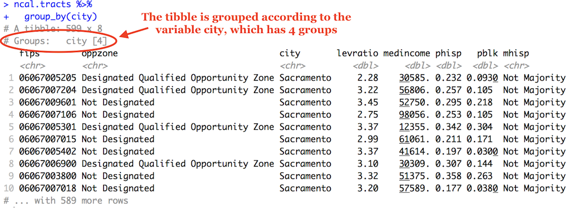
The second pipe takes this grouped dataset and sends it into the
summarize() command, which calculates the mean neighborhood
income (by county, because the dataset is grouped by county).
We can calculate more than one summary statistic within
summarize(). For example, to get the mean, median, standard
deviation and interquartile range (IQR) of median income, and give
column labels for the variables in the resulting summary table, we type
in
cal.tracts %>%
  group_by(county) %>%
  summarize(Mean = mean(medincome,  na.rm = TRUE),
            Median = median(medincome, na.rm = TRUE),
            SD = sd(medincome,  na.rm = TRUE),
            IQR = IQR(medincome,  na.rm = TRUE))
## # A tibble: 4 × 5
## county Mean Median SD IQR
## <chr> <dbl> <dbl> <dbl> <dbl>
## 1 Fresno County 57128. 50318 28347. 36875.
## 2 Sacramento County 71183. 65114 29249. 37807
## 3 San Diego County 83753. 79953 33262. 42475
## 4 Santa Clara County 129391. 123469 46599. 60069.Remember from Handout 4 that the IQR is the difference between the
75th and 25th percentiles. It is a measure of spread, and more
generally, an indicator of inequality. Another measure of spread or
inequality is the 90/10 ratio. To calculate this ratio, we’ll first need
to calculate the 90th and 10th percentiles using the
quantile() command, where we indicate the percentile using
the argument p =. We can do all of this inside
summarize(). Make sure you understand what each function in
the code below is doing, and what the values reported are showing.
cal.tracts %>%
  group_by(county) %>%
  summarize(p90 = quantile(medincome, p = 0.90,  na.rm = TRUE),
            p10 = quantile(medincome, p = 0.10,  na.rm = TRUE),
            Ratio9010 = p90/p10) %>%
  select(-(c(p90,p10)))
## # A tibble: 4 × 2
## county Ratio9010
## <chr> <dbl>
## 1 Fresno County 3.57
## 2 Sacramento County 2.89
## 3 San Diego County 2.80
## 4 Santa Clara County 2.58Categorical variables
Let’s next summarize a single categorical variable. status indicates whether a tract is urban, suburban or rural.
To get the proportion of tracts that are urban, suburban and rural,
you’ll need to combine the functions group_by(),
summarize() and mutate() using
%>%.
cal.tracts %>%
  group_by(status) %>%
  summarize(n = n()) %>%
  mutate(total = sum(n),
        freq = n / total)
## # A tibble: 3 × 4
## status n total freq
## <chr> <int> <int> <dbl>
## 1 Rural 20 1514 0.0132
## 2 Suburban 86 1514 0.0568
## 3 Urban 1408 1514 0.930Let’s break up this chunk of code to show exactly what was done here.
First, cal.tracts was piped into the group_by()
function. Next, group_by(status) separates the
neighborhoods by geographic status. We then used
summarize() to count the number of neighborhoods by
geographic status. The function to get a count is n(), and
we saved this count in a variable named n. This gave us the
following table.
cal.tracts %>%
  group_by(status) %>%
  summarize (n = n())
## # A tibble: 3 × 2
## status n
## <chr> <int>
## 1 Rural 20
## 2 Suburban 86
## 3 Urban 1408Remember, we are trying to get the proportion of neighborhoods that
are urban, suburban and rural. This means we need a numerator - the
number of neighborhoods that are urban, suburban and rural. This is what
n = n() gives us. There are 1,408 neighborhoods that are
designated as urban.
Next, this table is piped into mutate(), which creates a
variable total which gives you the denominator - the total
number of neighborhoods. The code sum(n) adds the values of
n: 1408+86+20 = 1514. We then create a variable freq,
which divides the value of each n by this sum: 20/1514. =
0.0132, 86/1514 = 0.0568 and 1408/1514. = 0.930. This yields the
proportion of all neighborhoods by geographic status (how would you
transform this to a percentage?).
cal.tracts %>%
  group_by(status) %>%
  summarize (n = n()) %>%
    mutate(total = sum(n),
        freq = n / total)
## # A tibble: 3 × 4
## status n total freq
## <chr> <int> <int> <dbl>
## 1 Rural 20 1514 0.0132
## 2 Suburban 86 1514 0.0568
## 3 Urban 1408 1514 0.930Summarizing two variables
The functions we’ve gone through so far describe one variable. It is often the case that we are interested in understanding whether two variables are associated with one another.
Let’s go through the ways we can describe the association between: (1) two categorical variables; (2) one categorical variable and one numeric variable; and (3) two numeric variables.
Two categorical variables
To summarize the relationship between two categorical variables,
you’ll need to find the proportion of observations for each combination,
also known as a cross tabulation. Let’s create a cross tabulation of the
categorical variables status and mhisp. We do this by
using both variables in the group_by() command.
cal.tracts %>%
  group_by(status, mhisp) %>%
  summarize(n = n())  %>%
    mutate(total = sum(n),
        freq = n / total)
## # A tibble: 6 × 5
## # Groups: status [3]
## status mhisp n total freq
## <chr> <chr> <int> <int> <dbl>
## 1 Rural Majority 14 20 0.7
## 2 Rural Not Majority 6 20 0.3
## 3 Suburban Majority 35 86 0.407
## 4 Suburban Not Majority 51 86 0.593
## 5 Urban Majority 264 1408 0.188
## 6 Urban Not Majority 1144 1408 0.812A much higher proportion of rural neighborhoods are Majority Hispanic (0.7) compared to urban neighborhoods (0.188).
One categorical, one numeric
A typical way of summarizing the relationship between a categorical variable and a numeric variable is to take the mean of the numeric variable for each level of the categorical variable. We can get the mean median household income for urban, suburban and rural neighborhoods using the following code.
cal.tracts %>%
  group_by(status) %>%
  summarize("Mean Income" = mean(medincome, na.rm = TRUE))
## # A tibble: 3 × 2
## status `Mean Income`
## <chr> <dbl>
## 1 Rural 46034.
## 2 Suburban 81730.
## 3 Urban 89891.Let’s separate by county by adding county to the
group_by() function.
cal.tracts %>%
  group_by(county, status) %>%
  summarize("Mean Income" = mean(medincome, na.rm = TRUE))
## # A tibble: 12 × 3
## # Groups: county [4]
## county status `Mean Income`
## <chr> <chr> <dbl>
## 1 Fresno County Rural 41470.
## 2 Fresno County Suburban 56237
## 3 Fresno County Urban 58808.
## 4 Sacramento County Rural 40395
## 5 Sacramento County Suburban 87334.
## 6 Sacramento County Urban 70536.
## 7 San Diego County Rural 51555.
## 8 San Diego County Suburban 91427.
## 9 San Diego County Urban 83710.
## 10 Santa Clara County Rural 99000
## 11 Santa Clara County Suburban 113092.
## 12 Santa Clara County Urban 130456.Which counties have the biggest differences income between rural and urban neighborhoods?
Two numeric variables
You can summarize the relationship between two numeric variables with
the correlation coefficient. To calculate the correlation coefficient,
use the function cor(). The first two arguments in
cor() are the two numeric variables you want to calculate
the correlation for. Let’s calculate the correlation between
neighborhood income and percent black. Note that the argument
use = "complete.obs" removes the missing values in
medincome.
cal.tracts %>%
  summarize(blk_inc = cor(medincome,pblk, use = "complete.obs"))
## # A tibble: 1 × 1
## blk_inc
## <dbl>
## 1 -0.398Group these correlations by county
cal.tracts %>%
  group_by(county) %>%
  summarize(blk_inc = cor(medincome,pblk, use = "complete.obs"))
## # A tibble: 4 × 2
## county blk_inc
## <chr> <dbl>
## 1 Fresno County -0.337
## 2 Sacramento County -0.449
## 3 San Diego County -0.338
## 4 Santa Clara County -0.305Make sure you understand what these values mean (see Handout 4).
Tables for presentation
The output from the descriptive statistics we’ve ran so far is not presentation ready. For example, taking a screenshot of the following results table produces unnecessary information that is confusing and messy.
cal.tracts %>%
  group_by(county) %>%
  summarize(Mean = mean(medincome,  na.rm = TRUE),
            Median = median(medincome, na.rm = TRUE),
            SD = sd(medincome,  na.rm = TRUE),
            IQR = IQR(medincome,  na.rm = TRUE))
## # A tibble: 4 × 5
## county Mean Median SD IQR
## <chr> <dbl> <dbl> <dbl> <dbl>
## 1 Fresno County 57128. 50318 28347. 36875.
## 2 Sacramento County 71183. 65114 29249. 37807
## 3 San Diego County 83753. 79953 33262. 42475
## 4 Santa Clara County 129391. 123469 46599. 60069.Furthermore, you would like to show a table, say, in your final project that does not require you to take a screenshot, but instead can be produced via code, that way it can be fixed if there is an issue, and is reproducible.
One way of producing presentation tables in R is through the flextable package. First, before creating any table, run the following code to ensure that the tables you save will have a transparent or white background (the default is gray).
set_flextable_defaults(background.color = "white")Next, you will need to save the tibble or data frame of results into an object. For example, let’s save the above results into an object named cal.summary
cal.summary <- cal.tracts %>%
  group_by(county) %>%
  summarize(Mean = mean(medincome,  na.rm = TRUE),
            Median = median(medincome, na.rm = TRUE),
            SD = sd(medincome,  na.rm = TRUE),
            IQR = IQR(medincome,  na.rm = TRUE))
You then input the object into the function flextable().
Save it into an object called my_table
my_table <- flextable(cal.summary)If you type in my_table in the console, you should see a
relatively clean table pop up in the Viewer window. We can progressively
pipe the my_table object through flextable
formatting functions. For example, you can change the column header
names using the function set_header_labels() and center the
header names using the function align()
my_table <- my_table %>%
          set_header_labels(
            county = "County",
            Mean = "Mean",
            Median = "Median",
            SD = "Standard Deviation",
            IQR = "IQR") %>%
  colformat_double(digits = 1) %>%
  align(align = "center")

my_table
County | Mean | Median | Standard Deviation | IQR |
|---|---|---|---|---|
Fresno County | 57,127.6 | 50,318.0 | 28,346.9 | 36,874.8 |
Sacramento County | 71,183.0 | 65,114.0 | 29,248.9 | 37,807.0 |
San Diego County | 83,753.0 | 79,953.0 | 33,261.5 | 42,475.0 |
Santa Clara County | 129,391.5 | 123,469.0 | 46,599.2 | 60,068.8 |
There are a slew of options for formatting your table, including adding footnotes, borders, shade and other features. Check out this useful tutorial for an explanation of some of these features.
Once you’re done formatting your table, you can then export it to
Word, PowerPoint or HTML or as an image (PNG) files. To do this, use one
of the following functions: save_as_docx(),
save_as_pptx(), save_as_image(), and
save_as_html(). For the final project, you will likely be
saving your tables as images. Before saving, make sure your working
directory is set to the appropriate folder (use getwd() to
get the current working directory). Then use the
save_as_image() function
save_as_image(my_table, path = "cal_income.png")You first put in the table my_table, and set the file name with the png extension. Check your working directory on your hard drive. You should see the file cal_income.png in the folder.
Summarizing variables using graphs
Another way of summarizing variables and their relationships is
through graphs and charts. The main package for R graphing is
ggplot2 which is a part of the
tidyverse package. The graphing function is
ggplot() and it takes on the basic template
ggplot(data = <DATA>) +
      <GEOM_FUNCTION>(aes(x, y)) +
<OPTIONS>()ggplot()is the base function where you specify your dataset using thedata = <DATA>argument.You then need to build on this base by using the plus operator
+and<GEOM_FUNCTION>()where<GEOM_FUNCTION>()is a uniquegeomfunction indicating the type of graph you want to plot. Each unique function has its unique set of arguments which you specify using theaes()argument.aes()stands for aesthetics - things we can see. Withinaes()you specify the variables you need to plot in the givengeom()or graph, typically based on what is plotted on thex =andy =axes. Charts and graphs have an x-axis, y-axis, or both. Check this ggplot cheat sheet for all possible geoms.<OPTIONS>()are a set of functions you can specify to change the look of the graph, for example relabelling the axes or adding a title.
The basic idea is that a ggplot graphic layers geometric objects (circles, lines, etc), themes, and scales on top of data.
You first start out with the base layer. It represents the empty
ggplot layer defined by the ggplot()
function with the data object whose variable(s) you want to graph.
ggplot(cal.tracts)
We get an empty plot. We haven’t told ggplot() what type
of geometric object(s) we want to plot, nor how the variables should be
mapped to the geometric objects, so we just have a blank plot. We need
geoms to paint the blank canvas.
From here, we add a geom layer to the
ggplot object. Layers are added to
ggplot objects using +, instead of
%>%, since you are not explicitly piping an object into
each subsequent layer, but adding layers on top of one another. Each
geom is associated with a specific type of graph. For
example, below is code that creates a histogram
ggplot(cal.tracts) +
  geom_histogram(aes(x=medincome))
cal.tracts is <DATA>,
geom_histogram() is the
<GEOM_FUNCTION>(), and x=medincome is
the variable in cal.tracts we are graphing. There is no
y argument specified because a histogram only plots one
variable (just on the x axis). Let’s go through how to create the graphs
outlined in Handout 4.
Bar charts
Recall from Handout 4 that we use bar charts to summarize categorical
variables. Bar charts, also known as bar plots, show either the number
or frequency of each category. To create a bar chart, use
geom_bar() for <GEOM_FUNCTION>(). Let’s
show a bar chart of status. We can use a bar chart to show the
number or count of observations for each category.
ggplot(cal.tracts) +
geom_bar(aes(x=status)) 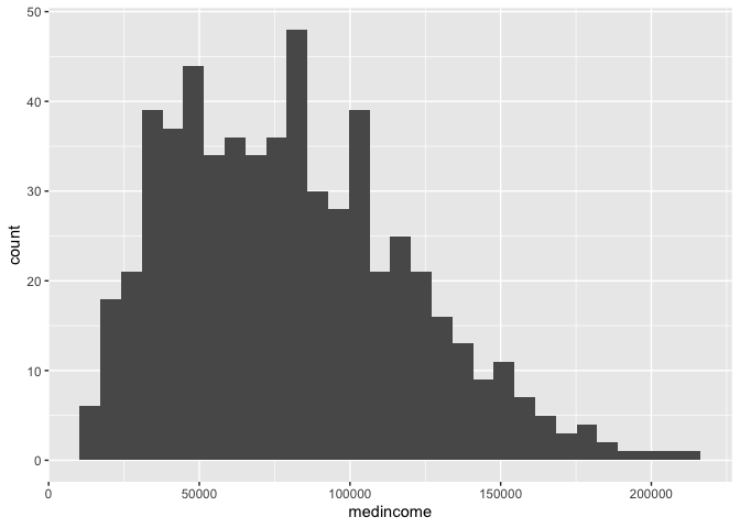
What if instead of counts, we want to show the proportions of each
category? ggplot() can’t automatically do this for us, so
we have to calculate those proportions (or percentages) on our own. We
can borrow from the code we used earlier to create our status
frequency table and pipe this table directly into
ggplot().
cal.tracts %>%
  group_by(status) %>%
  summarize (n = n()) %>%
    mutate(total = sum(n),
        freq = n / total)  %>%
  ggplot() +
    geom_bar(aes(x=status, y=freq),
stat="identity") 
We didn’t need to specify data = <DATA> in
ggplot() because it was piped in. Within
aes(), we specified the categorical variable
status on the x-axis and then the proportion of neighborhoods
freq on the y-axis. The argument stat = "identity"
tells ggplot() to plot the exact value listed for the
variable freq. Why is this outside the aes()
function? Variables (or columns of your data set) have to be defined
inside aes(). Whereas to apply a modification on
everything, we can set an aesthetic to a constant value outside of
aes(). Type ? geom_bar() to see what other
arguments you can use outside of the aes() argument.
The X and Y axes labels are not so great. Interpretable labels are
important for getting your message across clearly. We can relabel the
axes using the xlab() and ylab() functions,
which are examples of <OPTIONS>() functions.
cal.tracts %>%
  group_by(status) %>%
  summarize (n = n()) %>%
    mutate(total = sum(n),
        freq = n / total) %>%
  ggplot() +
    geom_bar(aes(x=status, y=freq),
             stat="identity") +
    xlab("Geographic Status") +
    ylab("Proportion")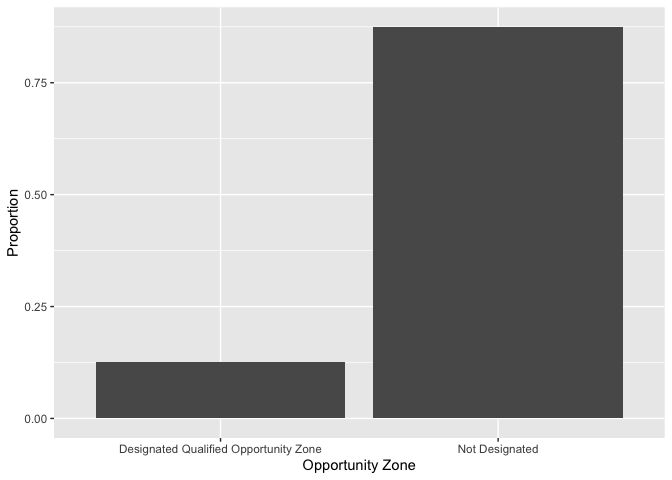
Histograms
Histograms are used to summarize a single numeric variable. To create
a histogram, use geom_histogram() for
<GEOM_FUNCTION()>. Let’s create a histogram of median
household income with an clearly defined axis label.
ggplot(cal.tracts) +
  geom_histogram(aes(x=medincome)) +
  xlab("Median Household Income")
## `stat_bin()` using `bins = 30`. Pick better value with `binwidth`.## Warning: Removed 6 rows containing non-finite outside the scale range
## (`stat_bin()`).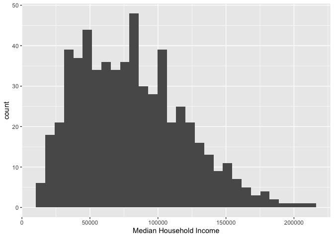
As described earlier, because a single variable is plotted on the
x-axis, we specify x = in aes() but not a
y =. The message before the plot tells us that we can use
the bins = argument to change the number of bins used to
produce the histogram. You can increase the number of bins to make the
bins narrower and thus get a finer grain of detail. Or you can decrease
the number of bins to get a broader visual summary of the shape of the
variable’s distribution. Try changing the number of bins and see what
you get.
Boxplots
We can use a boxplot to visually summarize the distribution of a
single variable or the relationship between a categorical and numeric
variable. Use geom_boxplot() for
<GEOM_FUNCTION()> to create a boxplot. Let’s examine
median household income.
ggplot(cal.tracts) +
     geom_boxplot(aes(y = medincome))+
ylab("Median Household Income") 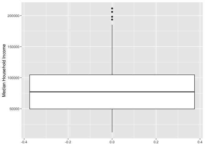
Remember from Handout 4 that the points outside the whiskers represent outliers. Outliers are defined as having values that are either larger than the 75th percentile plus 1.5 times the IQR or smaller than the 25th percentile minus 1.5 times the IQR. The IQR is $55,893, the 75th percentile is $112,372 and the 25th percentile is $56,479. While we don’t see outliers at the bottom, we do see outliers at the top - these are neighborhoods with median income values greater than $112,372 + 1.5*$55,893 = $196,211.5.
Let’s examine the distribution of median income by urban, suburban
and rural. Because we are examining the association between two
variables, we need to specify x and y
variables within aes().
ggplot(cal.tracts) +
    geom_boxplot(aes(x = status, y = medincome)) +
    xlab("Geographic Status") +
ylab("Median Household Income") 
The boxplot is for all neighborhoods combined. We can use the
facet_wrap()function to separate by county.
ggplot(cal.tracts) +
  geom_boxplot(aes(x = status, y = medincome)) +
  xlab("Geographic Status") +
  ylab("Median Household Income") +
facet_wrap(~county) 
Note the tilde operator ~ before county
We can flip the axes and can create horizontal boxplots. To create
horizontal boxplots, add the coord_flip() function at the
end.
ggplot(cal.tracts) +
    geom_boxplot(aes(x = status, y = medincome)) +
    facet_wrap(~county) +
    ylab("Median Household Income") +
    xlab("Geographic Status") +
    coord_flip()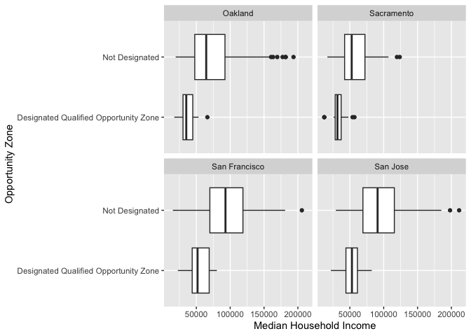
Scatterplots
The scatterplot is the traditional graph for visualizing the
association between two numeric variables. For scatterplots, we use
geom_point() for <GEOM_FUNCTION>().
Because we are plotting two variables, we specify an x and
y variable. Does median household income change with greater
percent Hispanic in the neighborhood?
ggplot(cal.tracts) +
    geom_point(aes(x = phisp, y = medincome)) +
    xlab("Percent Hispanic") +
    ylab("Median Household Income")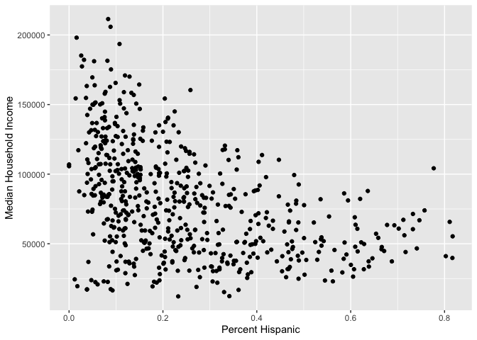
And for each county?
ggplot(cal.tracts) +
    geom_point(aes(x = phisp, y = medincome)) +
    xlab("Percent Hispanic") +
    ylab("Median Household Income") +
facet_wrap(~county) 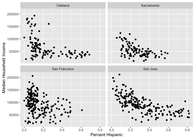
What do these scatter plots suggest about the relationship between income and percent Hispanic across these four counties?
ggplot() is a powerful function, and you can make a lot
of visually captivating graphs. We have just scratched the surface of
its functions and features. The list of all possible plots for
<GEOM_FUNCTION>() can be found here. You can also
make your graphs really “pretty” and professional looking by altering
graphing features using <OPTIONS(), including colors,
labels, titles and axes. For a list of options that alter various
features of a graph, check out Chapter 28
in RDS.
Here’s your ggplot2 badge. Wear it with pride!
Saving plots
You will, on occasion, need to save a plot to a specific file.
Specifically, we expect you to create plots and graphs, save them, and
upload them for your final project. Don’t use the built-in “Export”
button! If you do, your figure is not reproducible – no one will know
how your plot was exported. Instead, use ggsave() by
explicitly creating the figure and exporting
Let’s save the scatterplot of percent Hispanic and median household
income as a .png file named “phisp_inc.png”. First, we save the plot
produced by ggplot() into an R object named
phisp_inc
phisp_inc <- ggplot(cal.tracts) +
    geom_point(aes(x = phisp, y = medincome)) +
    xlab("Percent Hispanic") +
    ylab("Median Household Income")
Second, make sure you are pointing RStudio into the appropriate
folder to save your graph into. Check the working directory using
getwd(). We then save phisp_inc using
ggsave().
ggsave("phisp_inc.png", phisp_inc)Navigate to your working directory folder and you should see phisp_inc.png.

This
work is licensed under a
Creative
Commons Attribution-NonCommercial 4.0 International License.
Website created and maintained by Noli Brazil