Lab 6: Exploratory Spatial Data Analysis
CRD 150 - Quantitative Methods in Community Research
Professor Noli Brazil
May 7, 2025
In this guide you will learn how to conduct exploratory spatial data analysis (ESDA). Specifically, you will learn how to examine and quantify spatial clustering (autocorrelation). You will also gain skills in spatial data wrangling. The objectives of the guide are as follows
- Learn how to keep tracts that are within city boundaries
- Learn how to create a spatial weights matrix
- Calculate spatial autocorrelation
To achieve these objectives, you will be working with tract-level data on the foreign-born population in Sacramento. Specifically, we will examine to what degree the foreign-born population is clustered in the city. The clustering of the foreign born population is important to understand given the benefits and potential downsides of immigrant enclaves to health and well-being. This lab guide follows closely and supplements the material presented in Chapters 4.1 and 4.2 in the textbook Geocomputation with R (GWR) and Handout 6.
Assignment 6 is due by 12:00 pm, May 14th on Canvas.
See here for
assignment guidelines. You must submit an .Rmd file and its
associated .html file. Name the files:
yourLastName_firstInitial_asgn06. For example: brazil_n_asgn06.
Open up an R Markdown file
Download the Lab
template into an appropriate folder on your hard drive (preferably,
a folder named ‘Lab 6’), open it in R Studio, and type and run your code
there. The template is also located on Canvas under Files. Change the
title (“Lab 6”) and insert your name and date. Don’t change anything
else inside the YAML (the stuff at the top in between the
---). Also keep the grey chunk after the YAML. For a
rundown on the use of R Markdown, see the assignment
guidelines
Installing and loading packages
You’ll need to install the following packages in R. You only need to
do this once, so if you’ve already installed these packages, skip the
code. Also, don’t put these install.packages() in your R
Markdown document. Copy and paste the code in the R Console. We’ll talk
about what these packages provide as their relevant functions come up in
the guide.
install.packages("rmapshaper")
install.packages("spdep")
You’ll need to load the following packages. Unlike installing, you
will always need to load packages whenever you start a new R session.
You’ll also always need to use library() in your R Markdown
file.
library(tidyverse)
library(tidycensus)
library(sf)
library(tigris)
library(tmap)
library(rmapshaper)
library(spdep)
Bringing spatial data into R
We will be working with census tract data on the foreign-born
population in Sacramento city. We first need to get foreign-born
population data for California census tracts from the 2019-2023 American
Community Survey. Let’s use our best friends the Census API and the
function get_acs(). Remember that “E” at the end of the
variable indicates “Estimate” and “M” indicates margins of errors. We
won’t go through what the code is doing as all the functions have been
covered in past labs. See Lab 3
for grabbing ACS data from the Census API, and Lab 2 (and
Lab 3)
for data wrangling functions. We learned about getting spatial data from
get_acs() in Lab 5.
ca.tracts <- get_acs(geography = "tract",
              year = 2023,
              variables = c(fb = "B05012_003", totp = "B05012_001"),
              state = "CA",
              survey = "acs5",
              output = "wide",
              geometry = TRUE)

ca.tracts <- ca.tracts %>%
              mutate(pfb = 100*(fbE/totpE)) %>%
              rename(totp = totpE) %>%
              select(GEOID, totp, pfb)
Take a look at the data.
glimpse(ca.tracts)Next, let’s bring in the Sacramento City boundary using
places() from the tigris package, which we
first learned about in Lab 5.
Remember, since we brought in 2019-2023 ACS data above, you need to
specify year = 2023 in the places()
function.
pl <- places(state = "CA",
             cb = TRUE,
             year=2023)

sac.city <- pl %>%
            filter(NAME == "Sacramento")
Spatial data wrangling
The goal in this lab is to conduct exploratory spatial data analysis
to examine how spatially clustered the foreign born population is in
Sacramento City. Before we can do this, we need to keep the tracts from
ca.tracts that are in Sacramento City sac.city. Easier
said than done. Looking at the variables in the data frame
ca.tracts, we find that there is no variable that indicates
whether the tract belongs to Sacramento city. This includes the
GEOID, which only provides state and county census IDs. While
there is a county = argument in get_acs(),
there is no place = argument. In order to extract the
Sacramento tracts, we need to do some data wrangling. However, not just
any old data wrangling, but spatial data wrangling. Cue dangerous sounding
music.
Well, it’s not that dangerous or scary. Spatial Data Wrangling involves cleaning or altering your data set based on the geographic location of features. A common spatial data wrangling task is to subset a set of spatial objects based on their location relative to another spatial object. In our case, we want to keep California tracts that are in Sacramento city. Think of what were doing here as something similar to taking a cookie cutter shaped like the Sacramento city (in our case, the sf object sac.city) and cutting out the city from our cookie dough of census tracts (ca.tracts).
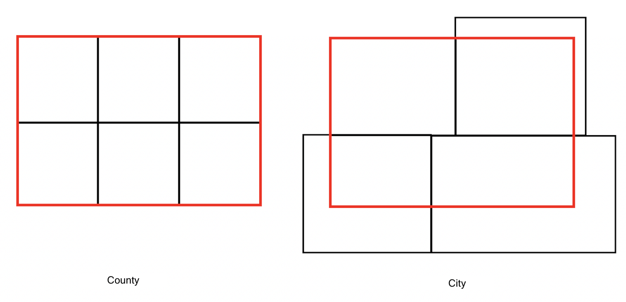
Recall from Handout 3 that census tracts neatly fall within a county’s boundary (remember the census geography hierarchy diagram from Handout 3). In other words, tracts don’t spill over. But, it does spill over for cities. The left diagram in the Figure below is an example of a county in red and four tracts in black - all the tracts fall neatly into the county boundary. In contrast, the right diagram is an example of a city on top of four tracts - one tract falls neatly inside (top left), but the other three spill out.
One way of dealing with this is to keep or clip the portion of the
tract that is inside the boundary. Clipping will keep just the portion
of the tract inside the city boundary and discards the rest of the
tract. We use the function ms_clip() which is in the rmapshaper
package. In the code below, target = ca.tracts tells R to
cut out ca.tracts using the sac.city boundaries.
sac.city.tracts <- ms_clip(target = ca.tracts,
                           clip = sac.city,
                           remove_slivers = TRUE)
Map the clipped tracts and the city boundaries.
tm_shape(sac.city.tracts) +
  tm_polygons(fill = "blue") +
tm_shape(sac.city) +
  tm_borders(col = "red")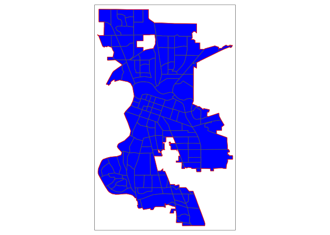
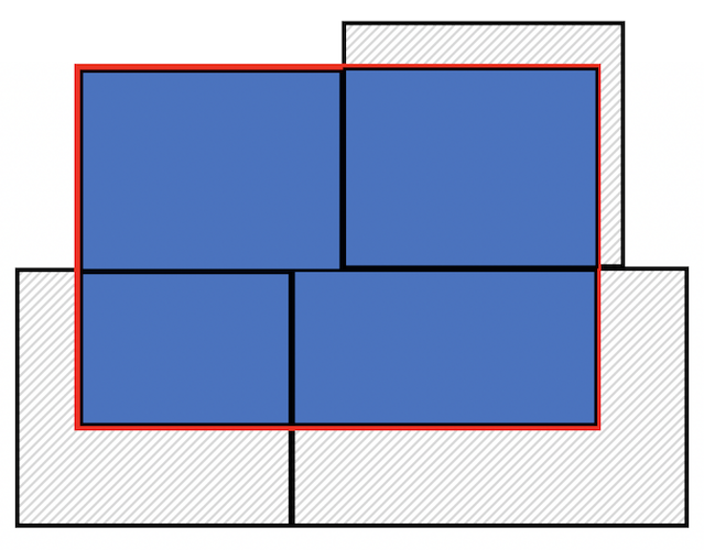
Now, the city is filled in with tracts. The argument
target = specifies the dough and clip =
specifies the cookie cutter. To be clear what a clip is doing, the
Figure below shows a clip of the city example shown in the first Figure
above. With a clip, one tract is not clipped because it falls completely
within the city (the top left tract). But, the other three are clipped -
the portions that are within the boundary are kept (in blue), and the
rest (with hash marks) are discarded from the map.
Because spatial data are not always precise, when you clip you’ll
sometimes get unwanted sliver polygons.
The argument remove_slivers = TRUE removes these
slivers.
The number of tracts in the City of Sacramento is
nrow(sac.city.tracts)## [1] 149Exploratory Spatial Data Analysis
Our goal is to determine whether the foreign-born population in Sacramento City is geographically clustered. We can explore clustering by examining maps and scatterplots. We can also formally test for clustering or spatial autocorrelation by calculating the Moran’s I, which is covered in Handout 6.
Exploratory mapping
Before calculating spatial autocorrelation, you should map your
variable to see if it looks like it clusters across space.
Using the function tm_shape(), which we learned about in Lab 5, and
the mapping principles we learned in last week’s lecture and in Handout
5, let’s make a nice choropleth map showing the percent foreign-born in
Sacramento city using quantile breaks.
tm_shape(sac.city.tracts, unit = "mi") +
  tm_polygons(fill = "pfb",
              fill.scale = tm_scale(style = "quantile", values = "red"),
              fill.legend = tm_legend(title = "")) +
  tm_scalebar(breaks = c(0, 1, 2), text.size  = 1,
              position = tm_pos_in("left", "bottom")) +
  tm_title("Percent Foreign-born in Sacramento City tracts, 2019-2023") +
  tm_compass(type = "4star", position = tm_pos_in("right", "bottom")) +
tm_layout(scale = 0.7) 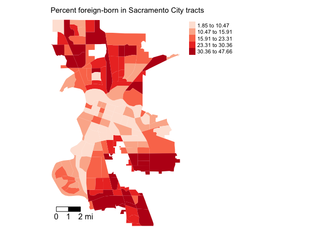
It does look like the foreign-born population clusters. In particular, there appears to be high concentrations of foreign-born residents in the South and North areas of the city. Sacramento is quite ethnoracially diverse, and South and North Sacramento in particular have an array of immigrant groups represented, including a hot spot of Vietnamese immigrants in South Sac and a large Slavic population located throughout the city.
Spatial weights matrix
Before we can formally model the spatial dependency shown in the above map, we must first cover how neighborhoods are spatially connected to one another. That is, what does “near” mean when we say “near things are more related than distant things”? You need to define
- Neighbor connectivity (who is you neighbor?)
- Neighbor weights (how much does your neighbor matter?)
We go through each of these steps below.
Neighbor connectivity
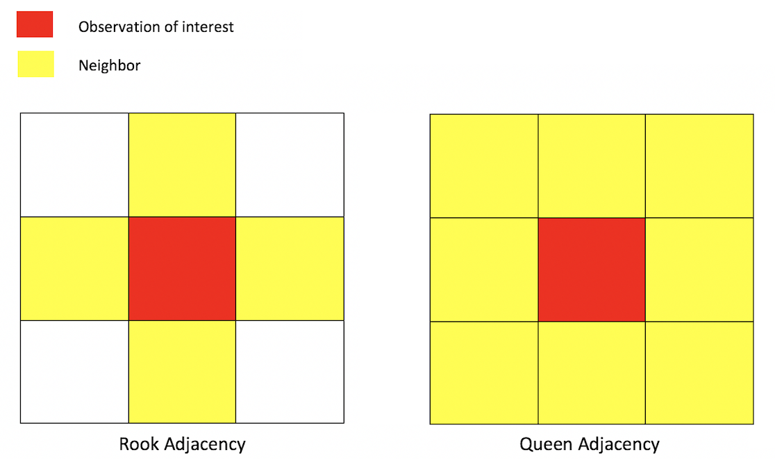
A common way of defining neighbors is to see who shares a border. The two most common ways of defining contiguity is Rook and Queen adjacency (Figure below). Rook adjacency refers to neighbors that share a line segment. Queen adjacency refers to neighbors that share a line segment (or border) or a point (or vertex).
Neighbor relationships in R are represented by neighbor nb
objects. An nb object identifies the neighbors for each
geographic feature in the dataset. We use the command
poly2nb() from the spdep package to create
a contiguity-based neighbor object.
Let’s specify Queen connectivity.
sacb<-poly2nb(sac.city.tracts,
              queen=T)
You plug the object sac.city.tracts into the first argument
of poly2nb() and then specify Queen contiguity using the
argument queen=T. To get Rook adjacency, change the
argument to queen=F.
The function summary() tells us something about the
neighborhood.
summary(sacb)The average number of neighbors (i.e. adjacent tracts) is 5.65, 1 tract has a low of 1 neighbor and 1 has a high of 12 neighbors. What is the modal number of neighbors?
Neighbor weights
We’ve established who our neighbors are by creating an nb
object using poly2nb(). The next step is to assign weights
to each neighbor relationship. The weight determines how much
each neighbor counts. You will need to employ the
nb2listw() command from the spdep package,
which will you give you a spatial weights object.
sacw<-nb2listw(sacb,
               style="W",
               zero.policy = TRUE)
In the command, you first put in your neighbor nb object
(sacb) and then define the weights style = "W".
Here, style = "W" indicates that the weights for each
spatial unit are standardized to sum to 1 (this is known as row
standardization - see Handout 6). For example, if census tract 1 has 3
neighbors, each of the neighbors will have a weight of 1/3. This allows
for comparability between areas with different numbers of neighbors.
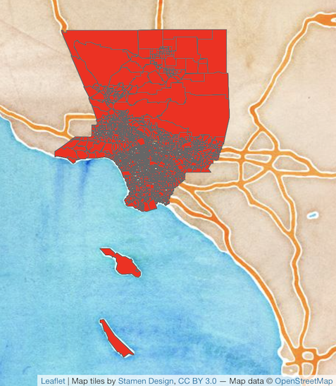
The zero.policy = TRUE argument tells R to ignore cases
that have no neighbors. How can this occur? The Figure
below provides an example. It shows tracts in Los Angeles county. You’ll
notice two tracts that are not geographically adjacent to other tracts -
they are literally islands (Catalina and San Clemente). So, if you
specify queen adjacency, these islands would have no neighbors. If you
conduct a spatial analysis of Los Angeles county tracts in R, most
functions will spit out an error indicating that you have polygons with
no neighbors. To avoid that, specify zero.policy = TRUE,
which will ignore all cases without neighbors.
Moran Scatterplot
We’ve now defined what we mean by neighbor by creating an nb
object using poly2nb() and the influence of each neighbor
by creating a spatial weights matrix using nb2listw(). The
map of percent foreign born showed that neighborhood percent foreign
born appears to be clustered in Sacramento. We can visually explore this
more by creating a scatterplot of percent foreign-born on the x-axis and
the average percent foreign born of one’s neighbors (also known as the
spatial lag) on the y-axis. We’ve already covered scatterplots in
Handout 4. The scatterplot described here is just a special type of
scatterplot known as a Moran scatterplot.
You can create a Moran scatterplot using the function
moran.plot() from the spdep package.
moran.plot(sac.city.tracts$pfb, sacw,
           xlab = "% foreign born",
           ylab = "Neighbors' mean % foreign born")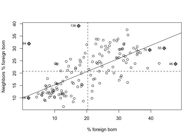
The first argument is the variable you want to calculate spatial
autocorrelation for. The function moran.plot() is not tidy
friendly, so we refer to the percent foreign born variable with a dollar
sign $, which we learned about in Lab 1.
sac.city.tracts$pfb will give you the percent foreign born as a
vector.
sac.city.tracts$pfbThe second argument is the spatial weights matrix that defines
neighbor and interaction. The xlab and ylab
arguments provide clean labels for the x and y axes.
The x-axis is a tract’s percent foreign born and the y-axis is the average percent foreign born of that tract’s neighbors. There is evidence of strong positive association - the higher your neighbors’ percent foreign born, the higher your own neighborhood’s percent foreign born. As we discussed in lecture, you can separate the plot into four quadrants based on positive and negative spatial autocorrelation.
Moran’s I
The map and Moran scatterplot provide descriptive visualizations of spatial clustering (autocorrelation) in the percent foreign born. But, rather than eyeballing the correlation, we need a quantitative and objective approach to measuring the degree to which places cluster. This is where measures of spatial autocorrelation step in. An index of spatial autocorrelation provides a summary over the entire study area of the level of spatial similarity observed among neighboring observations.
The most popular test of spatial autocorrelation is the Moran’s I
test. Use the command moran.test() in the
spdep package to calculate the Moran’s I.
moran.test(sac.city.tracts$pfb, sacw) ##
## Moran I test under randomisation
##
## data: sac.city.tracts$pfb
## weights: sacw
##
## Moran I statistic standard deviate = 11.387, p-value < 2.2e-16
## alternative hypothesis: greater
## sample estimates:
## Moran I statistic Expectation Variance
## 0.567395285 -0.006756757 0.002542549We find that the Moran’s I is positive (0.57) and statistically significant using a (p-value) threshold of < 0.05. Remember from lecture that the Moran’s I is simply a correlation, and we learned from Handout 3 that correlations go from -1 to 1. A 0.56 correlation is fairly high (meeting the rule of thumb of 0.30 described in Handout 6), indicating strong positive clustering. Moreover, we find that this correlation is statistically significant (p-value basically at 0).
Based on the following evidence
- A map of percent foreign born visually indicating geographic clustering
- The Moran scatterplot indicating a visual correlation between a neighborhood’s percent foreign born and its neighbors’ average percent foreign born
- A Moran’s I value that is
- Greater than 0.3
- Statistically significant from 0 with a p-value less than 0.05
we can conclude that the foreign-born population in Sacramento city exhibits positive spatial autocorrelation, or, is geographically clustered.

This
work is licensed under a
Creative
Commons Attribution-NonCommercial 4.0 International License.
Website created and maintained by Noli Brazil