Introduction to QGIS
CRD 150 - Quantitative Methods in Community Research
Professor Noli Brazil
March 9, 2020
In this guide you will learn how to use QGIS to make a map. The objectives of the guide are as follows
- Gain familiarity with the QGIS interface
- Load vector and text delimited data into QGIS
- Joining shapefile and attribute data in QGIS
- Creating and saving maps in QGIS
What is QGIS?
QGIS (or Quantum GIS) is an open source geographic information system, meaning that it can be downloaded and installed on your desktop free of charge. It runs on Windows, Mac OS X, and Linux. If you have used ArcGIS before, which all UC Davis affiliates have free access to, QGIS is very similar except that it has less functionality but is free for everyone and can be used on a Mac without having to rely on a virtualization software program like Parallels. QGIS is not like R in that its data processing and analysis capabilities are more limited. But, QGIS is, in my opinion, a better program for making a map. It is quicker to make a map in QGIS compared to R, allows more user efficiency and control over mapping aesthetics, and produces nice looking maps with relatively little cost in time, effort and learning curve. This is not to say that you should not use R for mapping. If you master spatial R, you can make some really cool maps with R. But, if you need to quickly make a nice looking map, QGIS is a great tool to have in your back pocket.
Downloading QGIS
You can download QGIS from its official developer website. I generally recommend using the most recent Long Term Release over the most recent version of QGIS. Long term releases might not have the newest features, but has fewer bugs and is less glitchy than the most recent release. The current long-term release is 3.10. For Windows, this will be labelled QGIS Standalone Installer Version 3.10. For Mac, this will be labelled QGIS macOS Installer Version 3.10.
This tutorial is based on QGIS version 3.10 for Windows. The guide’s instructions should not significantly differ across Mac and PC versions. However, installation instructions do have some key differences.
Windows users: You will need to choose between the 32-bit or 64-bit versions based on your particular operating system. If you don’t already know which one you have, you can figure it out.
Installation is pretty simple. Follow these steps:
From the QGIS download site, click on the appropriate 32- or 64-bit QGIS Standalone Installer Version 3.10
Click on the downloaded .exe file.
The installation wizard window below should pop up. Click Next.
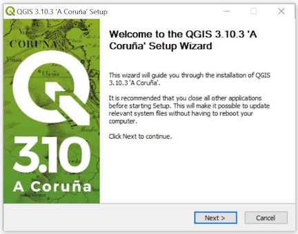
Figure 1: Windows QGIS Installation Wizard
A License Agreement window will pop up. Click on I Agree.
Choose an appropriate location on your hard drive to save QGIS. The default (Program Files) should be fine.
Don’t alter anything on the Choose Components page. Just click on Install. Wait a bit for it to install. A final window will pop up. Click on Finish and you’re all good.
Mac users: The method for downloading QGIS on a Mac will depend on the version of the operating system (OS) that your computer is running on. To find out your current Mac OS, click on the Apple icon located at the top left of your screen and then select About This Mac. A window should pop up giving your Mac’s current OS.
If you are running High Sierra (10.13) or newer, follow these simple directions:
From the QGIS download site, click on QGIS macOS Installer Version 3.10 and save the file in an appropriate location.
Click on the downloaded .dmg file
Next screen, click on Agree
The funky looking screen below should pop up. Click and drag the QGIS3.10 icon to the Applications folder. After that, you should be all good.
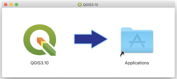
Figure 2: Mac QGIS Installation Window
If you have an earlier Mac OS version, you’ll have to download an earlier version of QGIS. If possible, update to a more recent Mac OS version, as QGIS no longer fixes any bugs for its older versions. However, if you’re afraid of updating your OS, click here to download an older version of QGIS. You should see all previous versions of QGIS. If your computer is super old, download QGIS 2.18.28.
Unfortunately, installation for older versions of QGIS is not as simple. Before you run the installer, you’ll need to make sure you can add new software to your Mac. Go to your System Preferences (under the Apple menu), and click on “Security & Privacy”. Click the lock icon in the bottom left to make changes. For the section titled “Allow apps downloaded from:”, Check the “Anywhere” radio button. Now you are ready to install. When you open the disk image that you downloaded, you’ll see the following files.
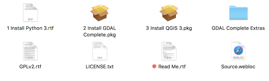
Figure 3: Mac QGIS Download package
First thing to do is to read the Read Me.rtf file. You must install Python, GDAL, and QGIS in that order. Installing separate components like this can seem a bit weird if you’re not used to installing open source software. For 3.4 and later versions, QGIS packaged all of these installations into one quick download.
Download Lab Files
We’ll be working with Sacramento county tracts in this lab. Go to the Week 10 Canvas folder and download the zip file qgisdata.zip onto a convenient place on your hard drive that you can readily access. Unzip the folder. The folder will contain the following shapefiles and csv files.
- Sacramento_County_Tracts.shp
- tract_demographics.csv
QGIS Interface
Open up QGIS. You should see an interface similar to Figure 4.
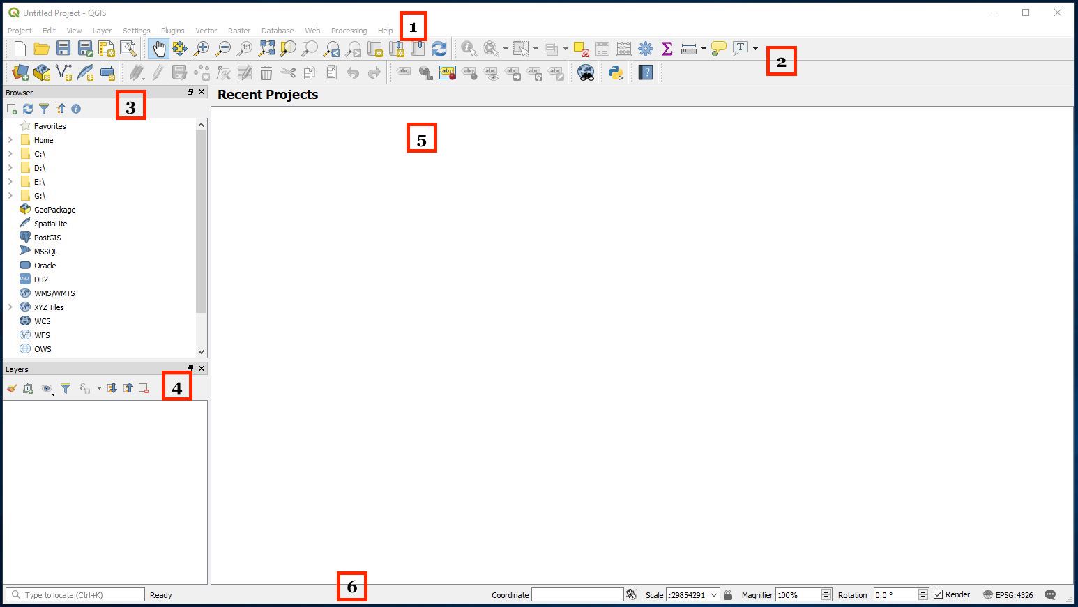
Figure 4: QGIS Interface.
The components of the interface are as follows
- Main Menu: Provides access and functions of the applications in a standard pull down menu format.
- Toolbars: Buttons that provide one click access to many of the features and functions found in the Main Menu. Toolbars are movable and can be docked or free floating. You can also customize what toolbars to show by right clicking (on a Windows machine) or Ctrl + clicking (on a Mac laptop) on one of the toolbars and selecting/deselecting from the menu.
- Browser Panel: Shows a listing of files on your computer. You can drag and drop GIS files into the Layers Panel (4) to view them.
- Layers Panel: Shows a listing of map layers and data files that are in your current project. Layers can be turned off and on, change drawing order, etc. Think of this as a Table of Contents.
- Map Display Panel: Shows a geographic display of GIS layers in the Layers panel.
- Status Bar: Shows the current scale of the map display, coordinates of the current mouse cursor position, and the coordinate reference system (CRS) of the project. In this guide, we won’t worry too much about this bar.
Bringing in a shapefile
Let’s bring in the shapefile of Sacramento county tracts. This is like st_read() in R. You can bring in a shapefile in one of the following ways.
- Select Layer in the Main Menu panel and scroll over Add Layer. You’ll find the various types of files you can bring into QGIS. Clicking on Add Vector Layer… to add a shapefile.
- Select Layer in the Main Menu panel and select Data Source Manager. This will bring up a screen (Figure 5) that will allow you to add files.
- You can bring up the Data Source Manager by also clicking on
 typically located in the Toolbars menu.
 - You can add a shapefile by clicking on the
 button, typically located in the Toolbars menu.
Let’s use the Data Source Manager approach. When you open up the Data Source Manager, you should get the following window
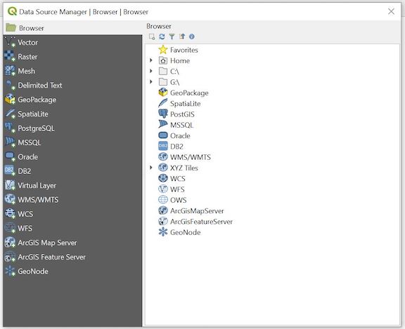
Figure 5: Data Source Manager
We want to bring in a shapefile showing Census tracts in Sacramento county. Tracts are polygon or areal data, also known as Vector data. From the Data Source Manager window, follow the steps outlined below.
- Select
 on the left panel. This should bring a screen shown in Figure 6.
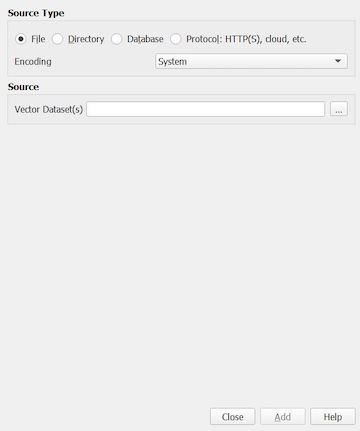
Figure 6: Adding Vector Data
- Under Source and next to Vector Dataset(s), click on
 at the far right.
- Navigate to the folder containing the files you downloaded from Canvas. Select the file “Sacramento_County_Tracts.shp”. To be clear, you will see a bunch of files named “Sacramento_County_Tracts”. Double click on the one highlighted in red in Figure 6.
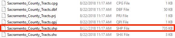
Figure 6: Click on the shapefile
- Click on the Add button
 and close the Data Source Manager. You should see tracts in Sacramento county pop up (Figure 7). It may have come in as a different color.
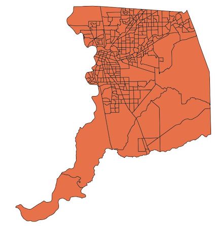
Figure 7: Sacramento county tracts
Bringing in a csv file
We got a shapefile into QGIS. Hooray for us! Let’s now map a variable by bringing in some data to map. Bring up the Data Source Manager and follow the steps below to bring in a csv file into QGIS. This is like read_csv() in R. The file contains tract-level percent Hispanic (phisp) and percent poverty (ppov).
- Click on
 . The window shown in Figure 8 should pop up on the right of your screen.
Figure 8: Adding data window
- Click on located at the far right next to the File Name box. We are going to bring in a csv (comma delimited) file containing tract-level percent Hispanic and percent poverty for the United States. These data are located in the file tract_demographics.csv. Navigate to the folder containing that file and double click on it.
- Leave all the default settings alone. However, click the arrow for Geometry definition and make sure the radio button next to No geometry (attribute only table) is checked. Your final setup should look something like Figure 9.
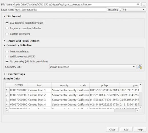
Figure 9: Bringing in a csv file
- Click on Add and then Close. The file tract_demographics should pop up in your Layers panel above Sacramento_County_Tracts like in Figure 10.
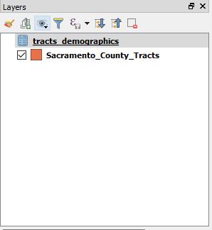
Figure 10: Layers panel
Joining a csv to a shapefile
We now want to join (merge) the csv data (tract_demographics) to the shapefile (Sacramento_County_Tracts). This is left_join() in R. To do this, follow the steps below.
- Right click on the Sacramento_County_Tracts file in the Layers panel. You should get a menu like in Figure 11.
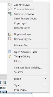
Figure 11: Right click on a layer
- Click on Properties.
- Click on the Joins button
 . A window should pop up that looks like Figure 12.
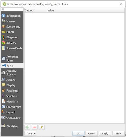
Figure 12: Layer properties
- Click on
 located at the bottom. The Add Vector Join window below should come up.
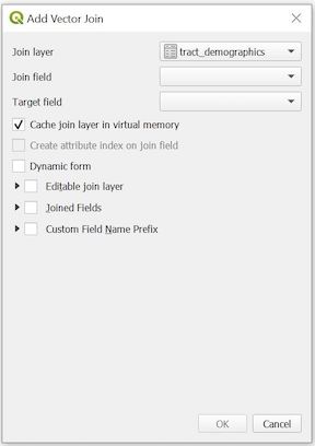
Figure 13: Add Vector Join
- From the Join layer pull down menu, select tract_demographics (if it isn’t already selected for you).
- Under Join field, select GEOID.
- Under Target field, select GEOID. We are joining the data from tract_demographics to Sacramento_County_Tracts using a common ID field - named GEOID in tract_demographics and GEOID in Sacramento_County_Tracts.
Check the Custom field name prefix box - a white box should pop up underneath - delete the text (tract_demographics_). If we did not do this, the variables phisp and ppov will be named tract_demographics_phisp and tract_demographics_ppov in the Sacramento_County_Tracts file, which are too long. By deleting it, we’ll keep the names to phisp and ppov.
The Add Vector Join window should look like Figure 14. Click OK. Click OK again in the next screen.
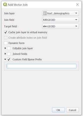
Figure 14: Add Vector Join Settings
To verify that the join worked, you can open up the attribute table for the shapefile. An attribute table consists of rows representing spatial features (census tracts), and columns representing properties or characteristics of the spatial feature (e.g. percent Hispanic). It’s a nonspatial dataset attached to the spatial dataset. To bring up the attribute table, you can either
- Right click on Sacramento_County_Tracts and select Open Attribute Table or
- Select Sacramento_County_Tracts. From the Toolbars menu, click on the Layers panel and then select Open Attribute Table
The table should pop up and contain 317 rows corresponding to the 317 tracts we have displayed on the map screen. See Figure 15. Scroll all the way right - you should see the variables we added from tract_demographics: ppov (percent poverty) and phisp (percent Hispanic).
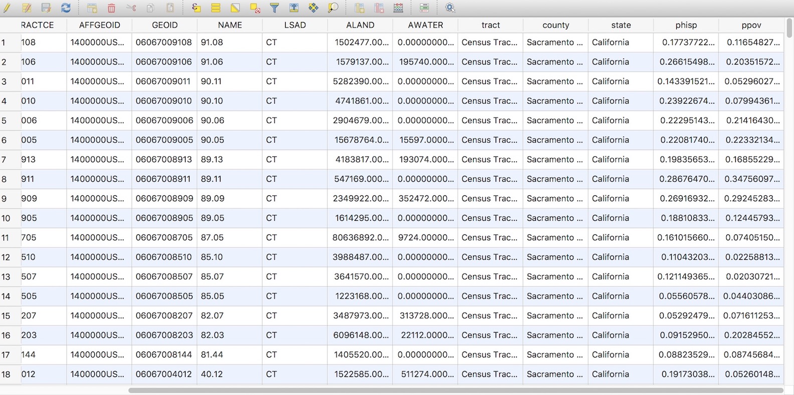
Figure 15: Attribute table
Saving a shapefile
Joining data to the shapefile is not permanent. If you close QGIS, reopen it, and bring in Sacramento_County_Tracts, you will find that phisp and ppov are no longer in the attribute table. You will need to save a new shapefile to make this join permanent. This is like st_write() in R. To save a shapefile, follow the steps below.
- Right click on Sacramento_County_Tracts
- Select Export and then select Save Features As. A Save Vector Layer as… window should pop up.
- For Format, select ESRI Shapefile.
- For File name, select and navigate to the folder you want to save the new shapefile. Give your new file the name “Sacramento_County_Tracts_Dems.shp”. Click Save.
- Keep everything else the same. You should have a window that looks like Figure 16. Click OK.
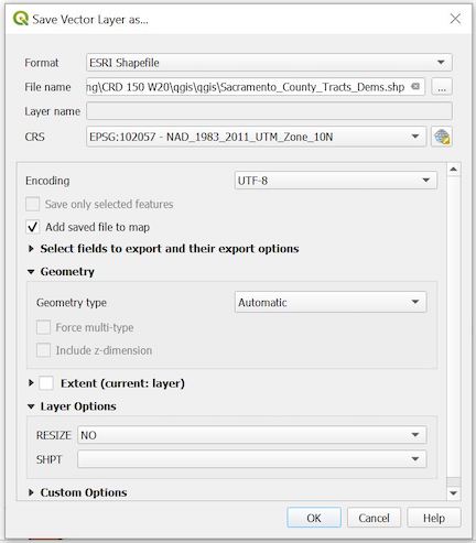
Figure 16: Saving your shapefile
- The window Coordinate Reference System Selector may pop up next. It will ask you to select the appropriate Coordinate Reference System (CRS). Under Coordinate reference systems of the world, there should be a window in which you can scroll through to find an appropriate CRS. The CRS NAD_1983_2011_UTM_Zone_10N should already be selected because that is the CRS for the original shapefile Sacramento_Country_Tracts. No need to change, so just select OK.
You should see Sacramento_County_Tracts_Dems pop up in your Layers panel. It should also pop up in the Map Display window in a different color. Because we only need this shapefile moving forward, remove tract_demographics and Sacramento_Country_Tracts by right clicking on each from the Layers panel and selecting Remove Layer. You can also click on the layer you want to remove and select  , which is located top right of the Layers panel.
Making a map
Let’s map percent poverty at the tract level for the county of Sacramento. This is like tm_shape() or ggplot() in R. The first thing to do is to symbolize the map based on percent poverty.
- Right click on Sacramento_County_Tracts_Dems and select Properties.
- Select the Symbology button
 on the left panel.
- From the top pull down menu, select Graduated (the default should be Single symbol). A graduated map relates values to color gradients on a map; each color gradation corresponds to a specific interval of values.
- We want to map percent poverty. From the Value pull down menu, select ppov
- Leave Symbol alone. In Legend Format, reduce the precision down to 2 (this will show percent poverty in two decimal points in the legend)
- You can select whatever color scheme you would like using the pull down menu from Color ramp. I kept it at the default - a graduated color scheme of white to dark red.
- The Mode near the bottom of the window tells QGIS how to break up the values. Remember from Lecture that you can easily distort your data by choosing different break values. Select Quantile (Equal Count) and keep Classes to 5. This will break up the values by quintile (bottom 20%, 20% to 40%, 40% to 60%, 60% to 80%, and top 20%). Click on Classify.
- The final setup should look like Figure 17. Click OK.
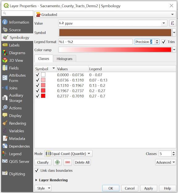
Figure 17: Symbology setup
You should get something that looks like Figure 18.
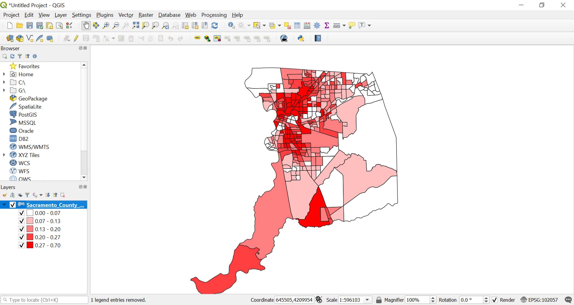
Figure 18: Map showing percent poverty in quintiles
Using Map Layout Manager
We’ve symbolized our map, but now we want to create and save a map for presentation purposes. QGIS has a powerful tool called Layout Manager that allows you to take your GIS layers and package them to create and save pretty maps. Why do we need this tool? A GIS map file is not an image. Rather, it saves the state of the GIS program, with references to all the layers, their labels, colors, etc. So for someone who doesn’t have the data or the same GIS program (such as QGIS), the map file will be useless.
To create a map, follow the steps below.
- From the Main Menu go to Project and click on New Print Layout. A dialog box will pop up asking you for a title - type in “Percent Poverty by Census Tract in Sacramento County”. Click OK.
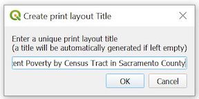
Figure 19: Map title
You should see a screen that looks like Figure 20 pop up. This is the Map Layout screen.
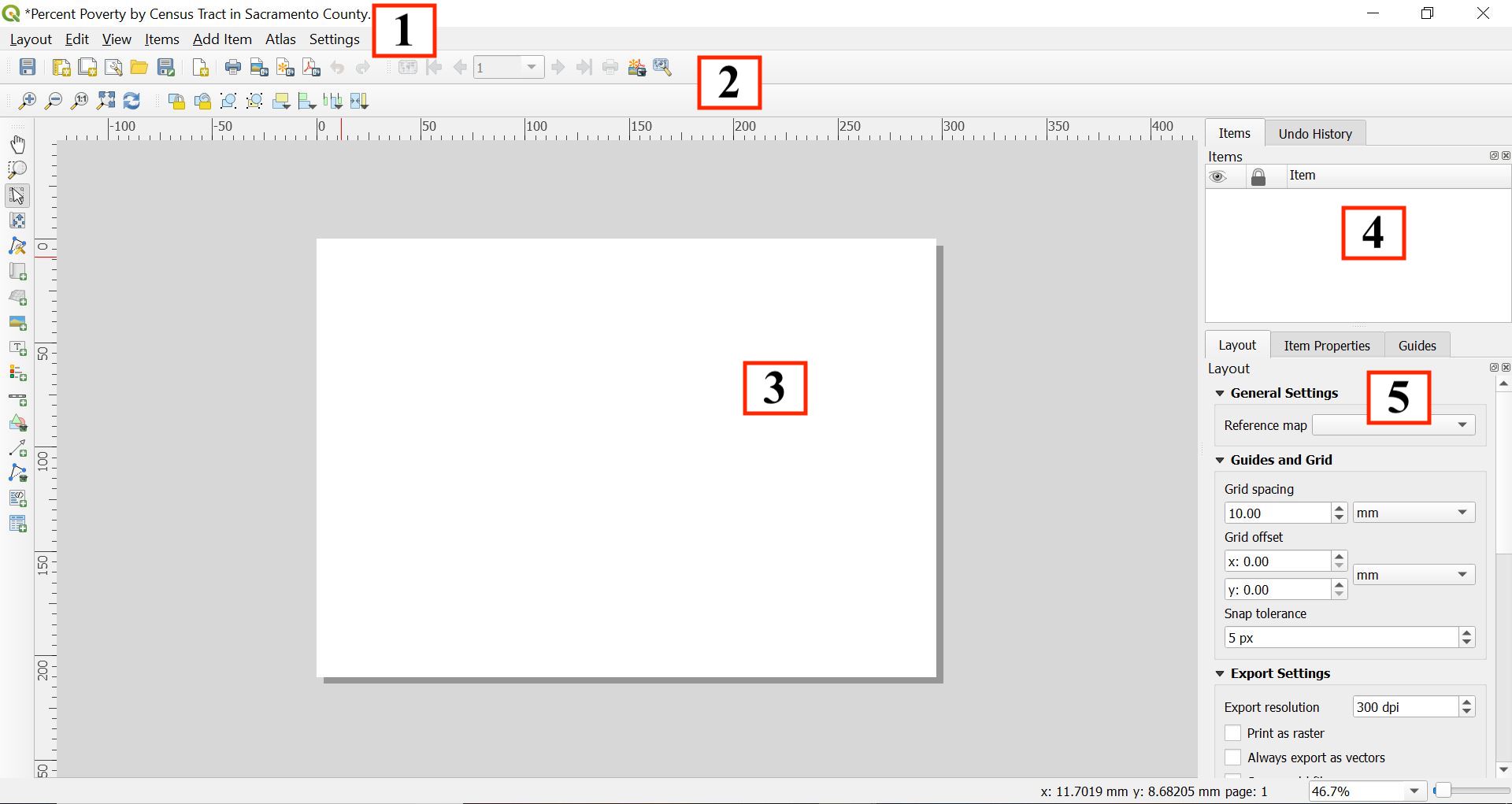
Figure 20: Map layout screen
Let’s go through each component of the Layout screen
- Main menu: Provides access and functions of the applications in a standard pull down menu format.
- Toolbars: There are toolbars located at the top and the left of the screen. These toolbars provide buttons to perform various functions. Right click to choose which toolbars to show
- Map window: This is where your map will be displayed. This includes legends, labels, titles, scale bars, north arrows, and other map accouterments.
- Items and History: This window provides two basic pieces of information: (1) what items are on your map (for the items you can add to your map, look at the menu Add Item from the main menu). Think of this as a table of contents. (2) all the actions you’ve done to your map. This can be simple actions like moving the legend around.
- Layout and properties: This window provides the properties of a selected item on your map. This is where you can change the appearance of any item on your map. For example, you can change the size of your legend font. The item whose properties you are viewing is listed at the top of this window - for example, if you are adjusting the legend, it will say Legend at the top of this panel.
To add our map, select Add Item from the Main Menu of the new screen and select Add Map.
Nothing should happen. However, your mouse cursor should look like a black cross. Move your cursor to the top left corner of the white canvas and drag it to the bottom right corner to create a rectangle. See Figure 21.
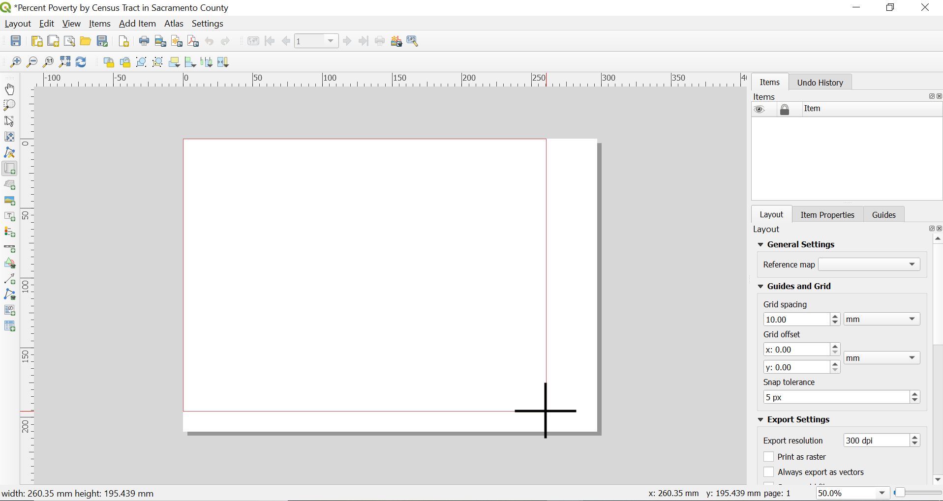
Figure 21: Adding your map
The map of Sacramento county maps should pop up. With the map now displayed, you can
- Move the map by clicking and dragging it around
- Resize it by clicking and dragging the boxes in the corners
- Add map details such as a legend and title.
The scale and extent of the map shown in the Map Layout will match what is shown in the main interface. The extent controls movement West, East, North and South. Scale controls zooming in and out. Toggle back to the main QGIS interface. If you want to make the map bigger or smaller in the Map Layout window, you can change the scale from the Status bar in the main interface. For example, the current scale I have in the main interface is
 . I can zoom in a little more - I can do this by using the
  tool or just type a scale in directly to the scale box. I do the latter by typing in, for example, 1:300000 and pressing enter.
Toggle to the Map Layout window. You will notice that nothing has changed. The scale in the Map Layout window will not update - you will have to do it manually. Click anywhere on your map in the Map Layout window. On the right panel of the window, click Item Properties, click on the button
 . See Figure 22.
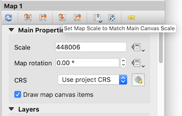
Figure 22: Set to map canas extent
If you move the position of Sacramento West, East, North or South in the main interface, you update the Map Layout by clicking on the Set Map Extent to Match Main Canvas Extent button 
- You should see Sacramento county fills up the page a little more. See the figures below for the difference. If your map is still too small or became too large, change the scale again. Higher values mean the map zooms out.
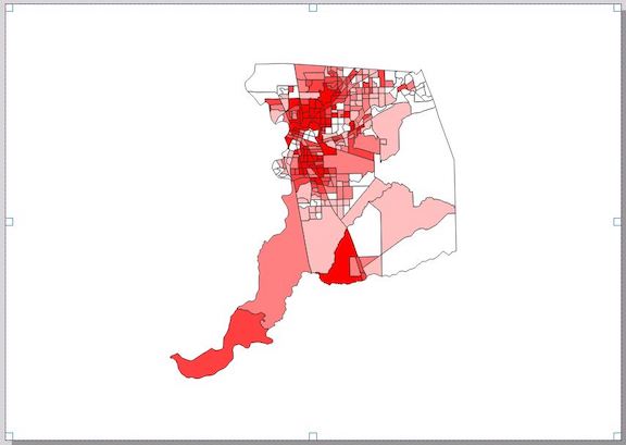
Figure 23: Scale of 1:350912
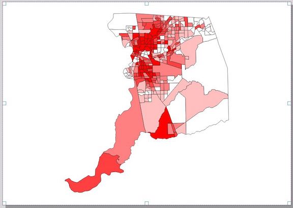
Figure 24: Scale of 1:300000
Add a legend
A legend is an essential feature in a map. To add a legend, follow the steps below.
- Click on Add Item from the Main Menu of the Map Layout window
- Click on Add Legend.
- A cross cursor will pop up, which means you’ll need to click, hold and drag to the place where you want to place the legend. See Figure 25.
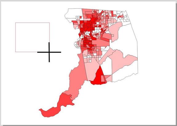
Figure 25: Adding a legend
If you want to customize the legend, click anywhere on the legend, and in the right panel under Item Properties a window named Legend should now be there. The panel provides different settings that you can alter to customize how the legend looks. For example, double click on Sacramento_County_Tracts_Dems under Legend items.
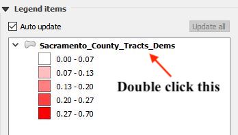
Figure 26: Legend items in Layout screen
This should bring up a little dialog box which allows us to give the legend a more descriptive title. Delete the current title “Sacramento_County_Tracts_Dems” and type in a more descriptive title, such as “Percent Poverty”. You can change the font size and color by altering the properties under Fonts.
Add a scale bar
A scale bar is an important component of a map because it gives the viewer a visual indication of the size of features, and distance between features, on the map. To add a scale bar
- Click on Add Item from the Main Menu of the Map Layout window
- Select Add scale bar.
- Click, hold and drag to place your scale bar, usually somewhere in the bottom right or left of the map.
Similar to legend, the scale bar properties should pop up in the bottom right panel. You can change its properties, for example going from Kilometers to (the US centric) miles and adding more segments. Here are a few changes we can implement:
- Change kilometers to miles by selecting Miles under the Scalebar units menu.
- Add additional segments to lengthen the bar by increasing “right 2” to “right 4” under Segments.
- Make sensible scale breaks by typing in 10 next to Fixed width.
So far, here’s what the map looks like.
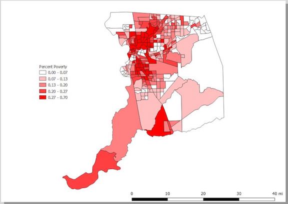
Figure 27: Map with legend and scale bar
Add a North arrow
Adding a north arrow improves many maps, especially large-scale maps that show a smaller area in great detail and maps that are not oriented with north at the top. To add a north arrow
- Click on Add Item from the Main Menu of the Map Layout window
- Select Add North Arrow
- Click, hold and drag to place the arrow, usually in one of the corners.
- Just like with the map, legend and scale, you can modify the picture’s properties from the panel on the right of the Map Layout window. From this panel. scroll down a little until you see Search directories - click on the arrow and you should see some preloaded images pop up (Figure 28)
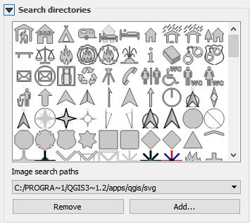
Figure 28: Picking a north arrow
- If you don’t like the default arrow, select your favorite image.
After selecting it, you can customize as you see fit. For example, I kept the default arrow  but altered the properties to make it look like
How did I make the arrow look like this?
- Under Main properties, I selected Middle in the Placement pull down menu to center the arrow.
- I selected black in the pull down menu next to Fill color under SVG Parameters to make the arrow black.
Add a title
You can’t have a map without a descriptive title. Let’s add one.
- Under Add Item from the Main Menu of the Map Layout window, select Add label.
- Click, hold, drag a rectangle across the top of the map.
- Very tiny text will pop up - it says “Lorem ipsum”, a common placeholder text. In the right panel, under Item Properties, a Label panel should have popped up. Under Main properties, delete the text “Lorem Ipsum” from the white text box and add an appropriate title (I used “Tract Percent Poverty in 2016, Sacramento County”).
As with all features, you can customize the title as you see fit. For example, staying in Item Properties, under Appearance, I
- Clicked on the Center radio button under Horizontal alignment and the Middle radio button under Vertical alignment to center the title.
- Clicked on the pull down menu directly under Appearance and increased the font size to 25. You might have to increase the title box to show the title now that you’ve increased its size.
If you need room at the top to fit the title, you’ll need to adjust the scale or extent from the main interface. My map now looks like Figure 29. Looks nice, right? Of course.
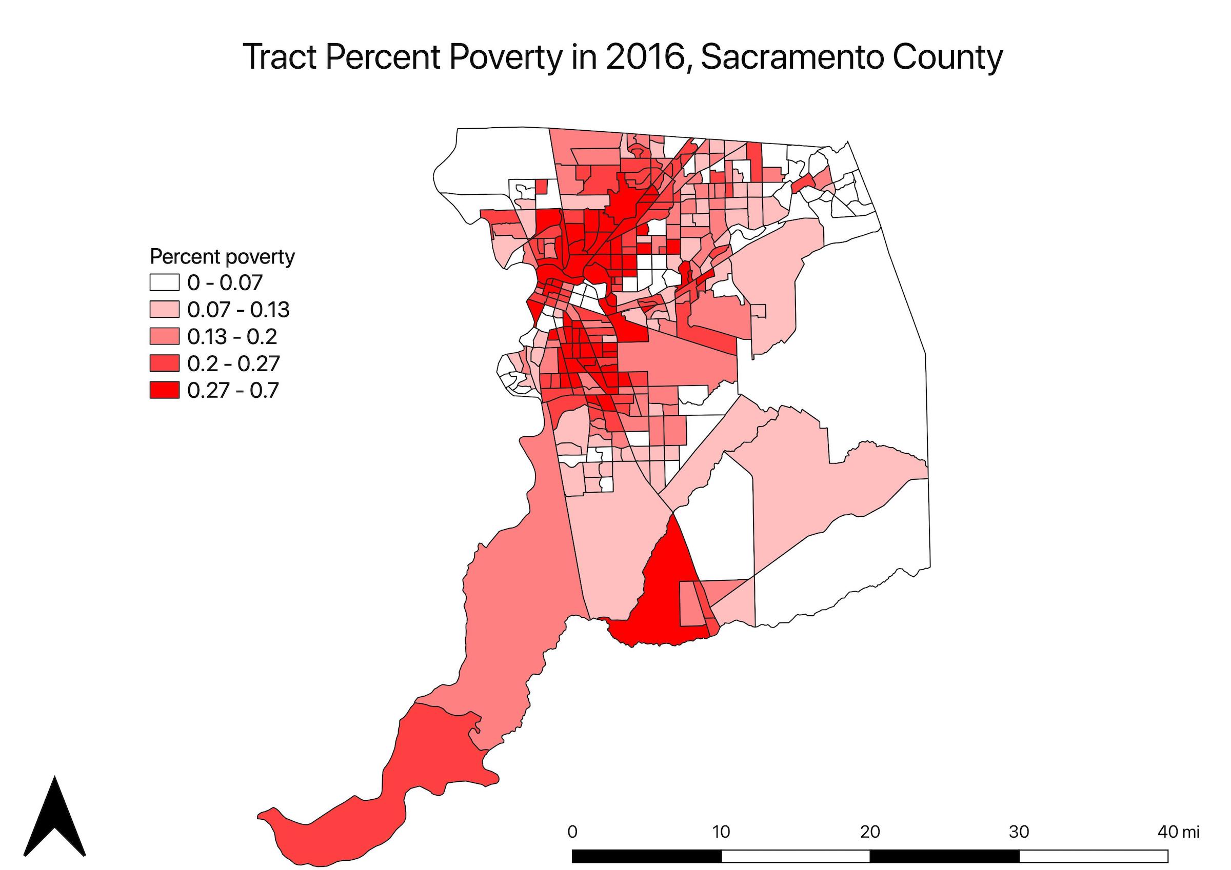
Figure 29: Map with the accoutrements
Add a basemap
Right now, it looks like Sacramento county is floating in space. There’s nothing necessarily wrong with this - check this gallery of QGIS maps or even do a basic Google search of Sacramento poverty map and you’ll find plenty of maps without context. But, we can provide some context to the map by adding a background. We can do this by adding a base map.
A base map provides geographical context to a region of interest. For example, a base map might help viewers orient themselves to a specific county by displaying the surrounding counties. QGIS has a few preinstalled basemaps that you can add to your map. Let’s add an OpenStreetMap basemap. OpenStreetMap is a free editable crowdsourced map of the world.
In the Browser window on the main interface, click on the arrow next to XYZ Tiles. The option OpenStreetMap should show up.
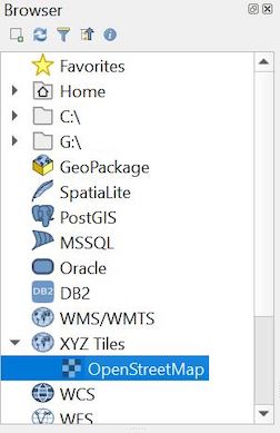
Figure 30: Selecting OpenStreetMap basemap
Double click on OpenStreetMap. The OSM basemap should pop up both in the Map and Layout views. You’ll see that these tracts are obscuring the Sacramento_County_Tracts_Dems layer. Change the layer order by clicking, holding and dragging the OpenStreetMap layer below Sacramento_County_Tracts_Dems in the Layers panel (or move the Sacramento_County_Tracts_Dems layer above).
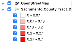
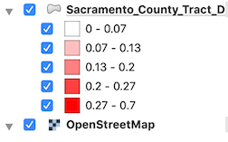
Figure 31: Changing the ordering through the Layers panel
You should see your symbolized map of Sacramento county tract poverty pop up.
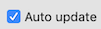
Go back to the Map Layout window. You will notice that the OpenStreetMap layer was added to the legend. To take it out
- Click on the legend. This should bring up the Legend properties on the right panel.
- Scroll down to Legend Items and unclick Auto Update
 .
.
- In the Legend Items window, click on the OpenStreetMap layer.
- Below the Legend Items window, click on
 . The OpenStreetMap layer should no longer be in the legend.
You can further customize the map as you see fit. I ended up with the map shown in the figure below.
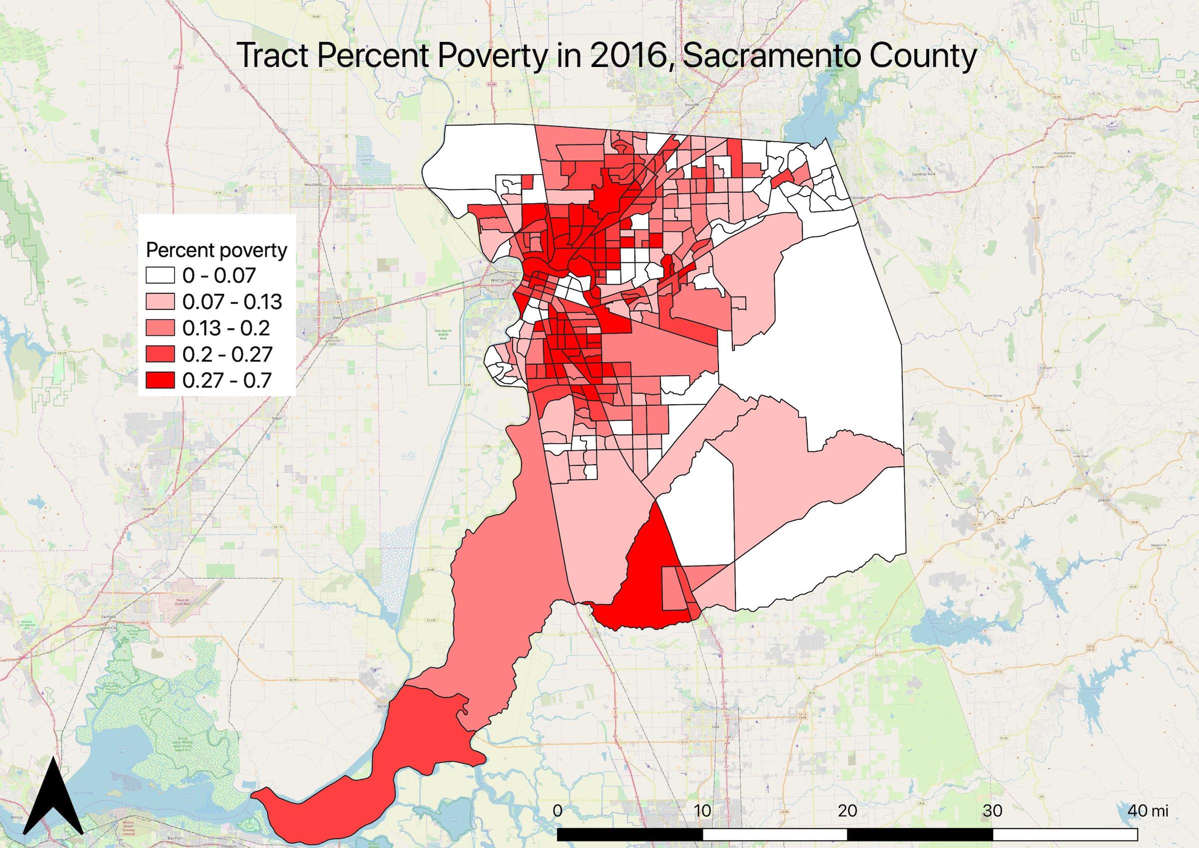
Figure 32: Map with OpenStreetMap basemap
You can add other freely available basemaps like Google Maps. For more details on how to do this, read this informative blog post.
Saving your map
Ultimately, you’ll want to share this map with others. You usually do this by sharing it as a jpeg or pdf. If you save it as a jpeg, you can paste it into a word document or PowerPoint presentation. To export your map
- Select Layout from the Main Menu of the Layout view.
- Select either Export as Image or Export as PDF.
- Save the file with an appropriate name in the appropriate folder.
Saving your project
When saving a project you are not saving actual data files. That is, you are not saving Sacramento_County_Tracts_Dems. Project files do not contain maps, instead they contain information on where original shapefiles are stored and what processes are needed to recreate a map. A saved project file includes information about the path to each data layer included as well as your choices about symbology, labels, and layer order. Before closing QGIS, users should save their progress in a Project file so it can be used and edited in the future. It is important to note that all shapefiles associated with the map must stay in the same location when you first created the map. If they are moved, QGIS will not be able to locate the files and rebuild the map. To save a project
- From the Main Menu of the main interface, select Project
- Select Save
- Navigate to the folder that contains the data you’ve uploaded into your current project. Type in an appropriate name and select Save.
The project file will be saved as a .qgz, which can be only opened in QGIS.
More Resources
This tutorial scratches the surface of what you can do with QGIS. You can get more practice by using the official QGIS training manual here. They also have a more Gentle Introduction to QGIS
Because QGIS is open source like R, this means users can create and add to QGIS’ basic functionality. These additions come in the form of plugins. A list of all available QGIS plugins can be found here.
To add a plugin
- Select Plugins from the main menu
- Select Manage and Install Plugins.
- In the text box at the top of the window that pops up, type in a search keywords, plugins matching your search will pop up below.
- Click on the plugin and hit Install.
And by now, most of you are aware of StackExchange, a network of Q&A communities. QGIS has its own StackExchange community, which you can find here

This work is licensed under a Creative Commons Attribution-NonCommercial 4.0 International License.
Website created and maintained by Noli Brazil